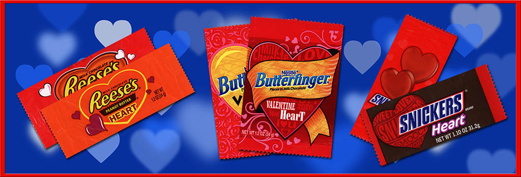
Over the course of time almost all candy packaging designs change and evolve – some subtly and some dramatically. Those changes are a big part of what makes collecting them and discussing them here so much fun. And just as all-year-round packaging designs change, so do holiday editions. In 2014 it happened that a number of prominent brands refreshed their Valentine’s Day holiday designs with new looks.
It’s pretty fun to see them all together to compare and contrast, so today I am excited to share a variety of Valentine wrapper redesigns for 2014!
When an all-year-round candy wrapper changes, it’s usually easy to spot. Oftentimes you find instances of both the old and new designs of the package on store shelves at the same time – sometimes in the very same display box. But with seasonal releases it’s not always so obvious because you only see them for a month or two and then not again until the following year. Also, seasonal package designs tend to stick around for a few years – they’re rarely one-and-done.
Of course, as a collector I’m tuned into these changes so I took note when a number of prominent brand Valentine packages all got refreshed for the 2014 season. Not sure what it was, but something about 2014 sent a collective message to several major candy companies to put out new designs for the romantic holiday.
Four companies’ redesigns are represented today; Hershey, Nestle, Mars and Wrigley (Wrigley being a subsidiary of Mars these days). Not only that, there are some fascinating similarities between the package redesign directions these different companies took.
First up from Hershey is one of my favorites, the Reese’s Heart. For previous years, Reese’s Heart wrappers featured a design with a primarily red color scheme – centered with an orange heart shape:
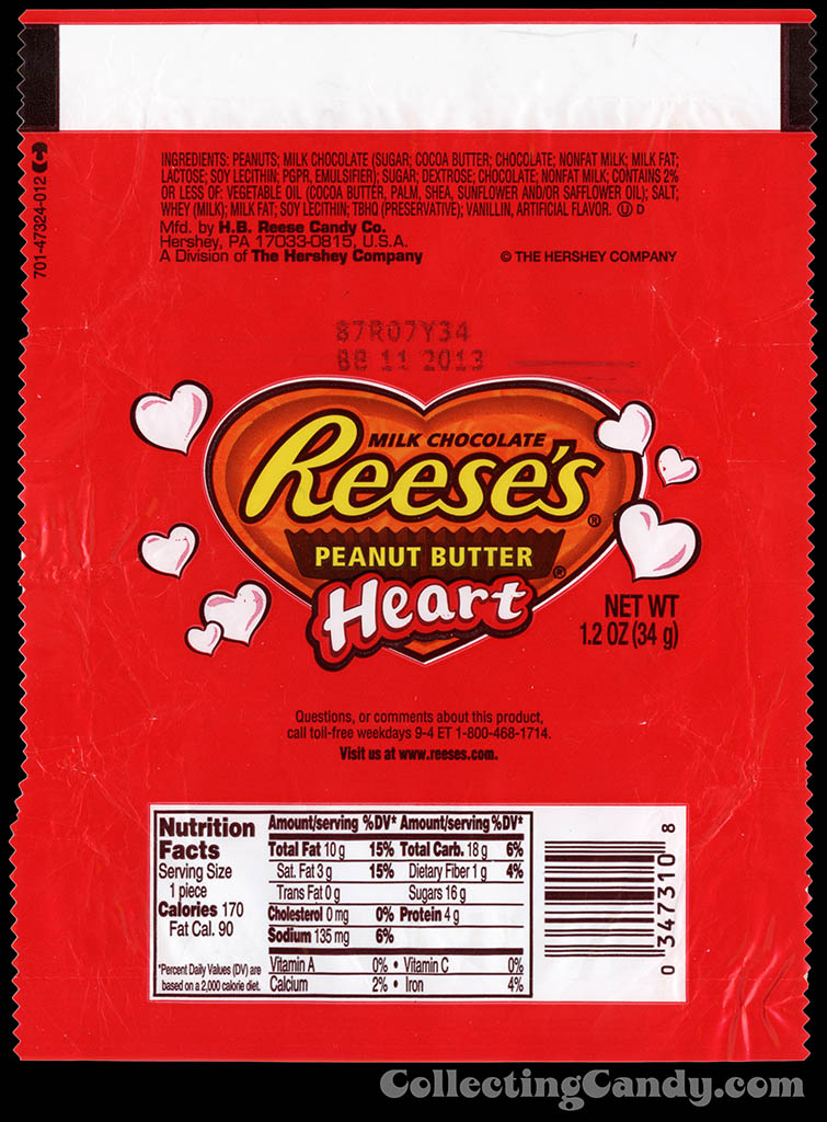
Hershey – Reese’s Peanut Butter Heart – 1.2 oz Valentine’s chocolate candy bar wrapper – 2013
For 2014, Reese’s Hearts have followed the lead set by their Pumpkins from last fall by taking on a much more standard line-wide look. Reese’s Hearts now share the mostly orange color palette of the rest of the Reese’s family:
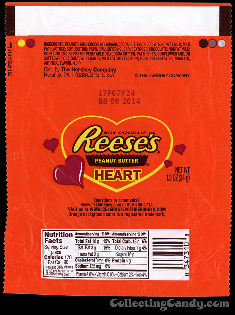
Hershey – Reese’s Peanut Butter Heart – 1.2 oz Valentine’s chocolate candy bar wrapper – 2014
Next up is Nestle, who refreshed the look of both their Nestle Crunch and Butterfinger Hearts:
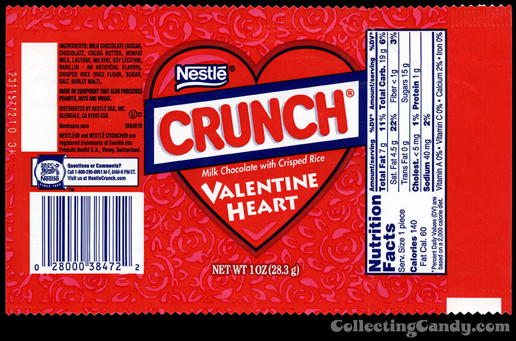
Nestle – Crunch Valentine Heart – 1 oz candy wrapper – 2013
The new designs share their overall look, with both incorporating a very cool “Laugh-In” or vintage concert poster style of shaped lettering within the hearts:
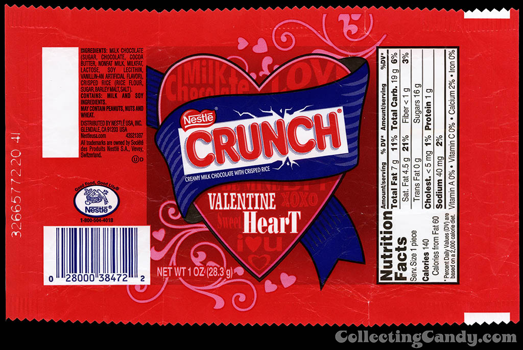
Nestle – Crunch Valentine Heart – 1 oz candy wrapper – 2014
Here are the Butterfingers:
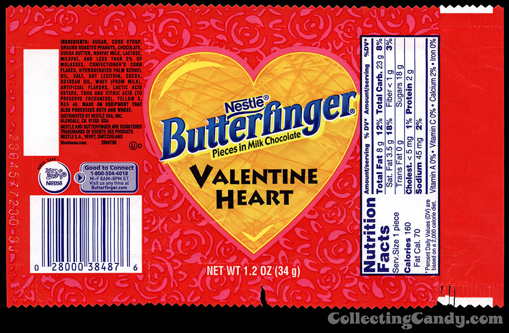
Nestle – Butterfinger Valentine Heart – 1.2 oz candy wrapper – 2013
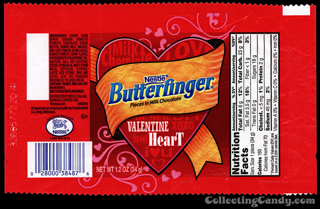
Nestle – Butterfinger Valentine Heart – 1.2 oz candy wrapper – 2014
Question: Do any of my designer friends out there know exactly what that style of type design is called (putting stacked type into shapes like that)? I’d be curious to know, because coincidentally that style is also put to work on the new Snickers Heart wrappers this year.
Here’s the previous wrapper design for Snickers Heart:
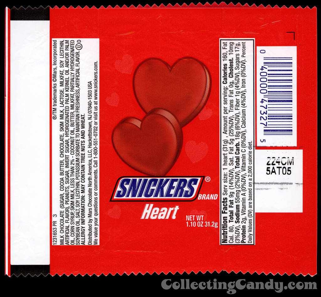
Mars – Snickers Heart – 1.10 oz Valentine’s chocolate candy wrapper – 2013
The new Snickers Heart design features a change in orientation from vertical to horizontal (or portrait to landscape, if you prefer). Also, and similarly to how Reese’s 2014 Valentine wrapper design takes on more of the all-year-round color scheme, so does this year’s Snickers offering – by incorporating the standard Snickers dark brown color:
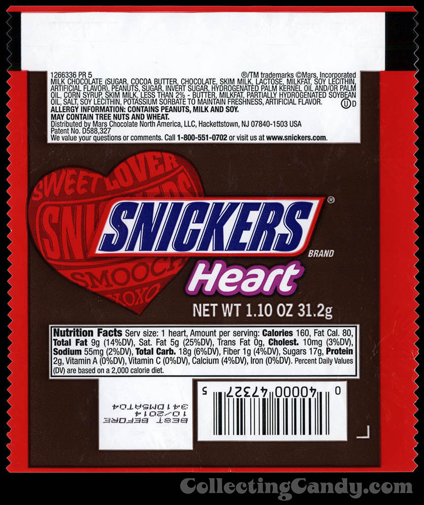
Mars – Snickers Heart – 1.10 oz Valentine’s chocolate candy wrapper – 2014
After looking at the new Snickers and Nestle offerings, do you see what I mean about the shaped letters in the heart? It’s definitely some kind of trending design approach this Valentine season. Though I think it’s fun and I quite dig it, in both Nestle’s and Mars’ cases.
Last year, Mars released a Milky Way Simply Caramel branded heart for Valentine’s Day – one that shared an overall wrapper look with that of the Snickers Heart. I was never able to find a version for this year, so based on that I’m guessing this was a one-and-done. But if anyone out there spotted a new version of Simply Caramel Heart – let me know. Here’s what it looked like last year:
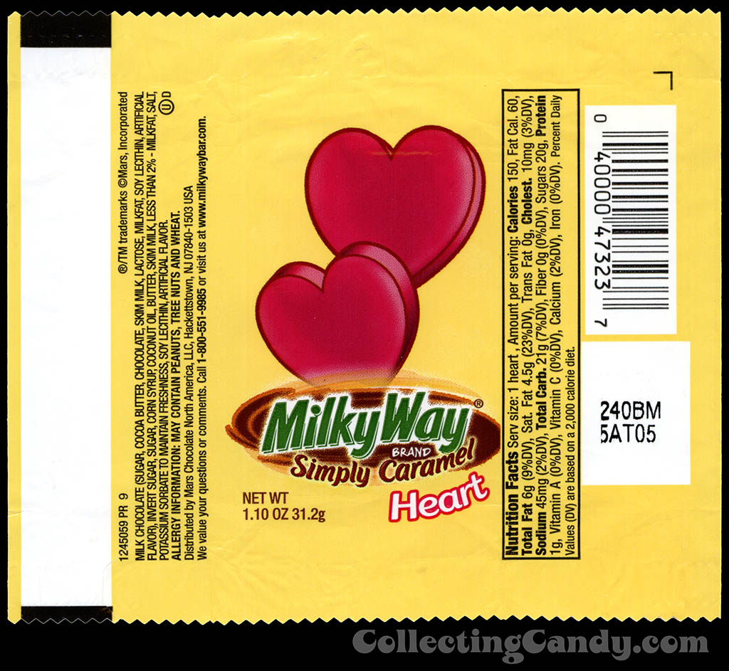
Mars – Milky Way Simply Caramel Heart – 1.10 oz Valentine’s chocolate candy wrapper – 2013
Last up for today is a look at new Valentine’s packaging from Skittles – and this time in theater box form.
For the past several years, Skittles has chosen Wild Berry to be their representative flavor for Valentine’s Day and that continues with a new box design this year. Unlike with the other examples shown today, the most obvious reason for the refresh of the Skittles Valentine box is that the all-year-round Skittles line received a makeover this year. Part of the new Skittles packaging look was changing from an erupting rainbow design to one with a cool swooping rainbow. This year’s Valentine box reflects that main line Skittles redesign:
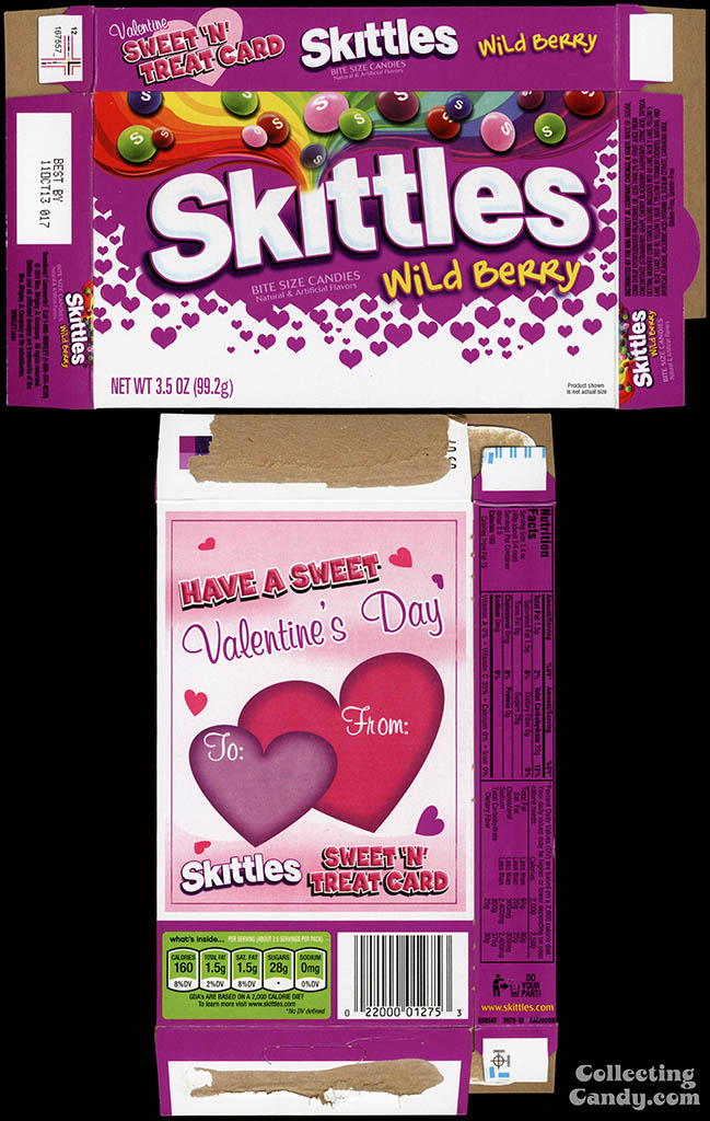
Wrigley – Skittles Wild Berry – 3.5 oz Valentine’s Edition candy box – 2013
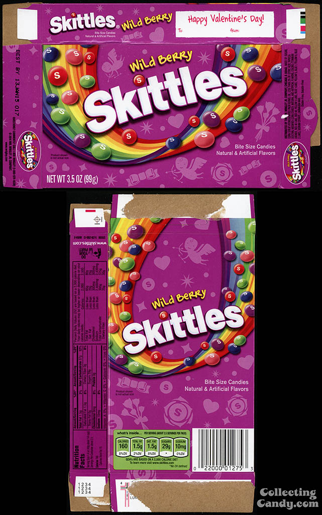
Wrigley – Skittles Wild Berry – 3.5 oz Valentine’s Edition candy box – 2014
While it’s not unusual to see a company refresh their holiday package designs, I think it is unusual to find this many major brands all doing so for the same season. I’m glad I had the opportunity to zero in on the changes and to bring them to light here. I hope you enjoyed seeing them.
And that’s everything for today. See you next time!


Pingback: Reese’s Footballs for Superbowl Sunday 2016! | CollectingCandy.com