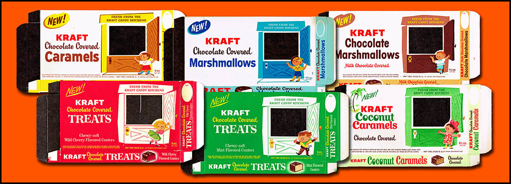
 I recently had the opportunity to take possession of a really neat group of unused vintage product packaging, all from the 1962-1963 period. Originally saved by a salesman from the Marathon printing company, they were used to showcase the kinds of packages his company could provide to clients. Among these 50-year-old package samples was a fantastic assortment of six candy boxes made to hold a variety of treats from the Kraft Candy Kitchens!
Packaging from this era can be a bit plain at times, but it can also be incredibly fun. Today I get to showcase a sampling of the latter. During a time when product marketing was just beginning to go national and television was becoming a significant vehicle to reach consumers – these packages evoke an early kids’ show feel to them. Each one features an illustrated child on the front of the box presenting an open door – actually a cellophane window which would have showcased the candy contents for potential consumers.
Both the fronts and backs feature wonderful period commercial artwork that is, in my opinion, worthy of appreciation. In an age of computer layout and Photoshop magic, I will always marvel at what was produced back then. Here they are:
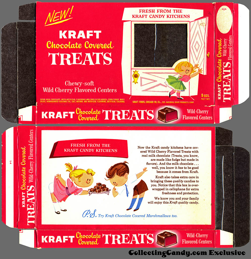
Kraft Candy Kitchens – Chocolate Covered Wild Cherry Treats – candy box – Marathon printer package sample – 1962
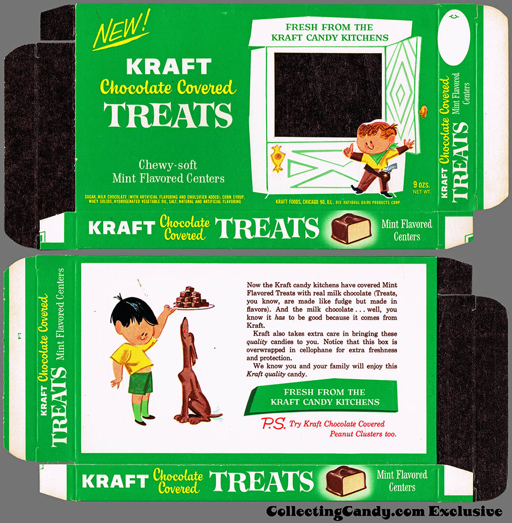
Kraft Candy Kitchens – Chocolate Covered Mint Treats – candy box – Marathon printer package sample – 1962
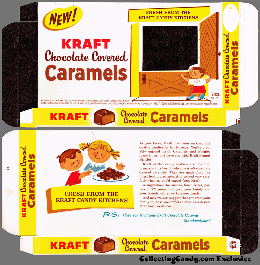
Kraft Candy Kitchens – Chocolate Covered Caramels – candy box – Marathon printer package sample – 1962
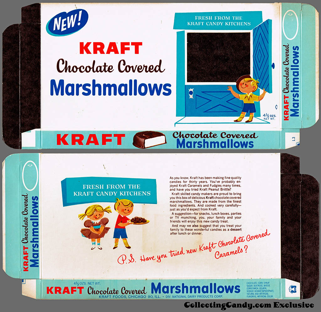
Kraft Candy Kitchens – Chocolate Covered Marshmallows – candy box – Marathon printer package sample – 1962
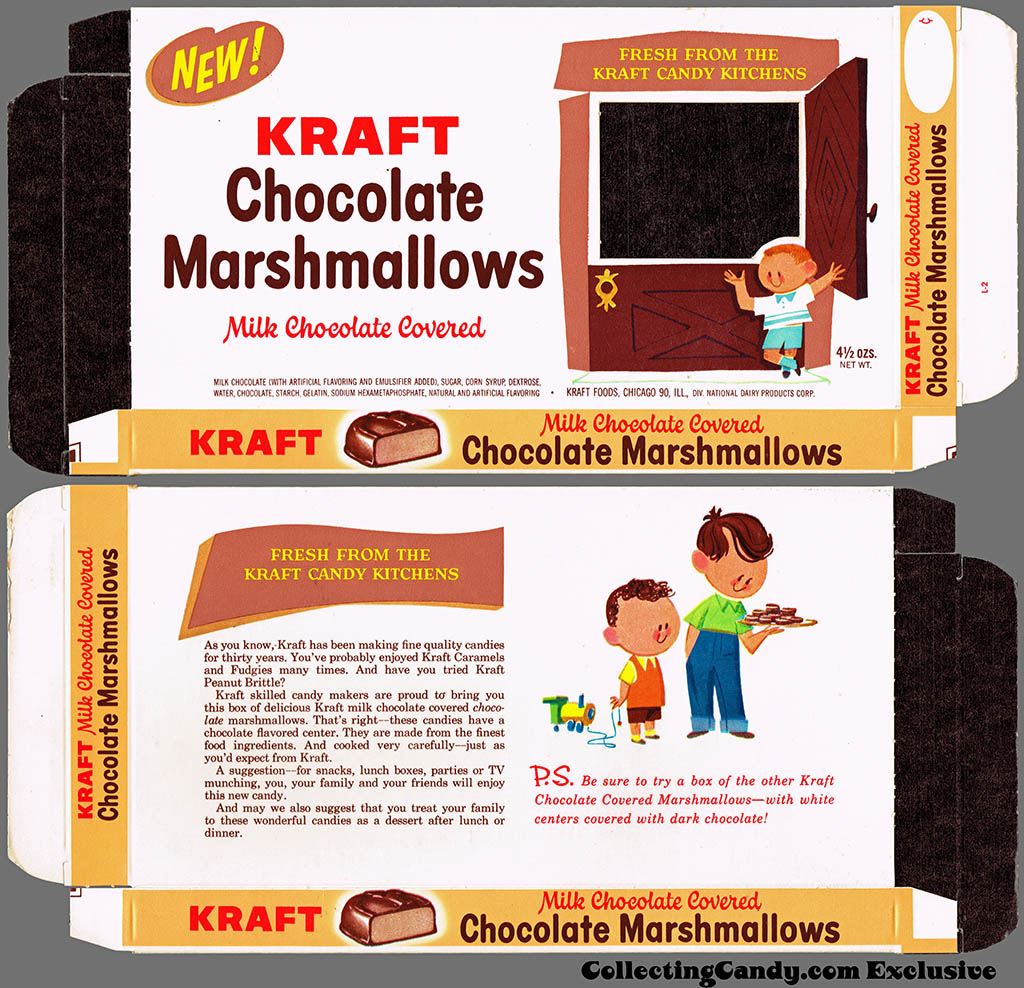
Kraft Candy Kitchens – Chocolate Marshmallows – candy box – Marathon printer package sample – 1962
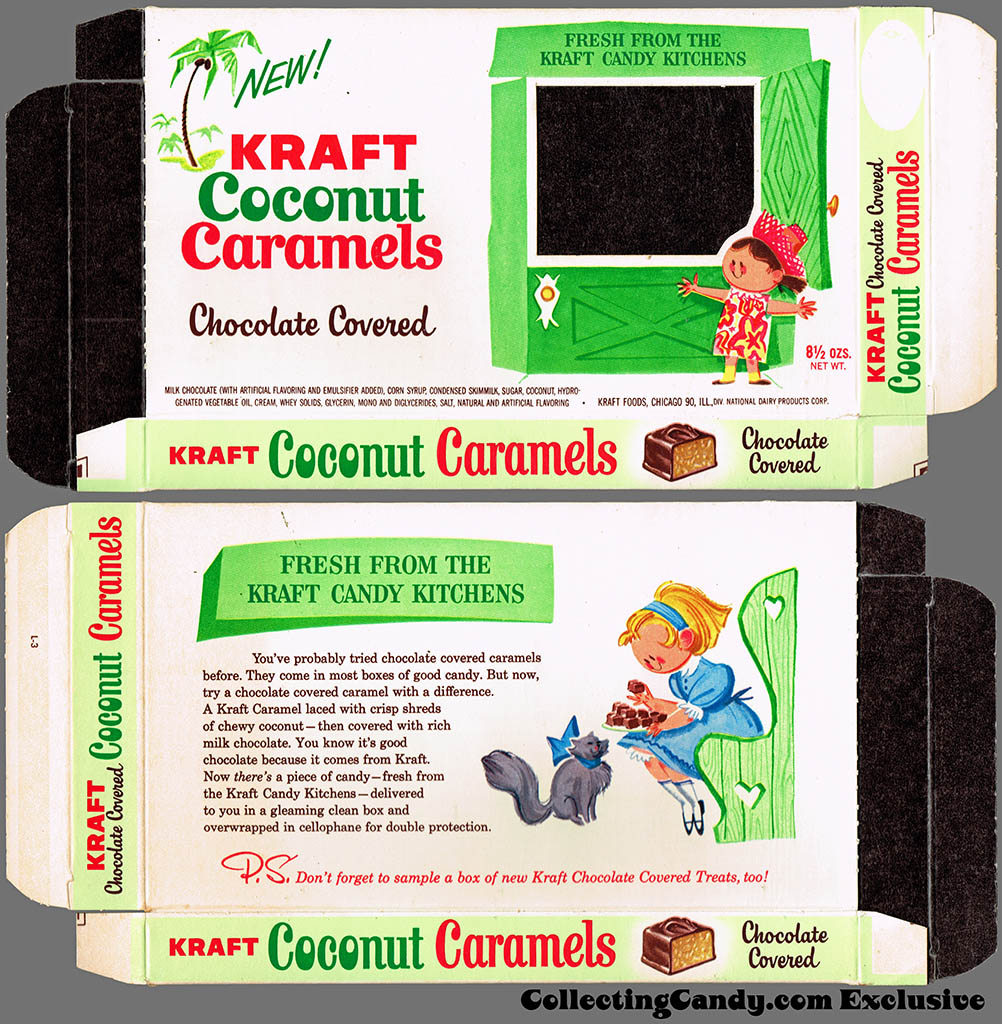
Kraft Candy Kitchens – Coconut Caramels – candy box – Marathon printer package sample – 1962
Lovely stuff that hearkens back to a simpler time in how candy was packaged and marketed. And that’s everything for today’s post.
See you next time!


Very cool; I’d love to try that Wild Cherry flavor!
Interesting how awkward some of the wording sounds, compared to modern copy. Especially, “Treats, you know, are made like fudge but made in flavors,” and the urging to note the cellophane overwrap.
I wonder why they printed the inside of the packages black.