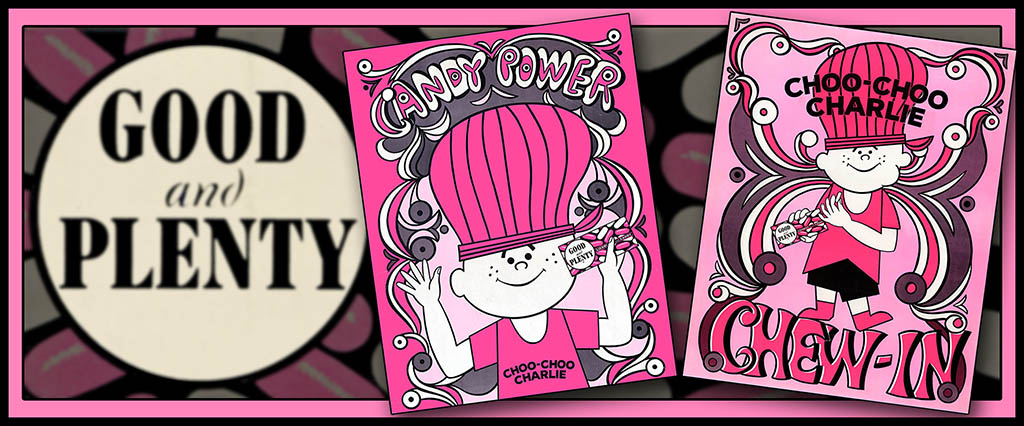
Candy-related premiums are not a big part of my focus or area of interest though I do find myself enamored with one from time to time, especially when they turn out to be more than just a cheap tchotchke with the brand’s logo slapped on it. Such was the case when I discovered the existence of a pair of groovy Choo-Choo Charlie day-glo posters released by Good and Plenty in the late 1960’s. Make the jump to check them out.
I don’t have anything that ties this promotion to a specific year but based upon the box design that the offer was found on, I’ve estimated that it was on store shelves in the late 1960’s. Here’s a look at the original box:
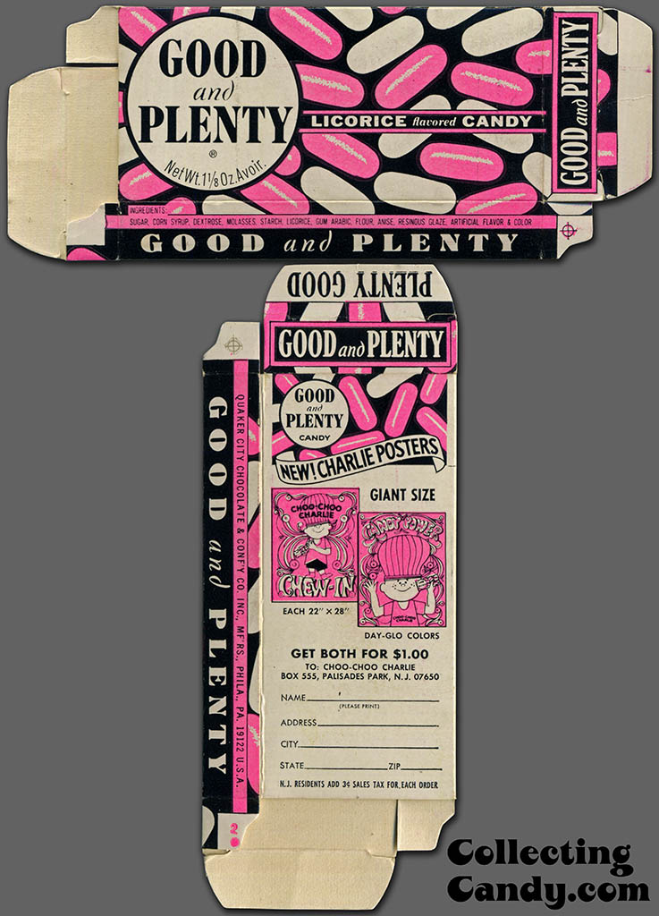
Quaker City Chocolate & Confectionery Company – Good and Plenty licorice flavored candy – day-glo Charlie posters offer – 1 1/8 oz candy box – late 1960’s – courtesy Dan Goodsell
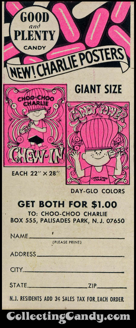
Good and Plenty day-glo Charlie posters offer – isolated – late 1960’s
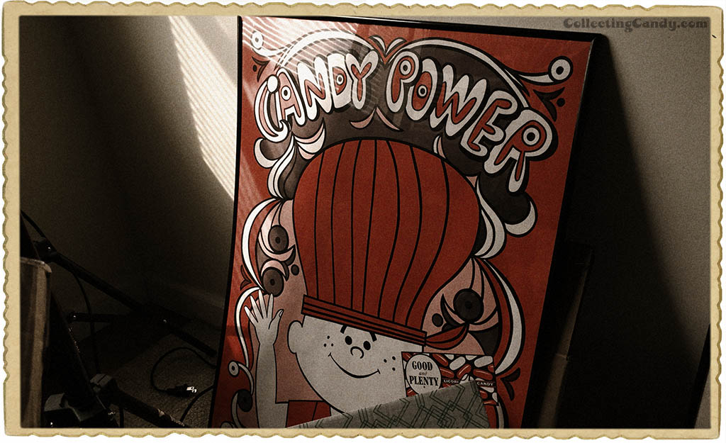
I was fascinated by the designs on these posters when I first saw them as they each co-opted some of the counter-culture lingo that was prevalent during the era. On them, the protest term “Sit-In” becomes “Chew-In” and the anti-war concept of “Flower Power” becomes “Candy Power”, all delivered by Good and Plenty’s happy and wholesome Choo-Choo Charlie mascot character.
As a candy enthusiast, it was the “Candy Power” sentiment that had me excited to add one of these two posters to my collection some years ago. “Candy Power” as a message seemed to embody much of what I was trying to do and say. Here it is:
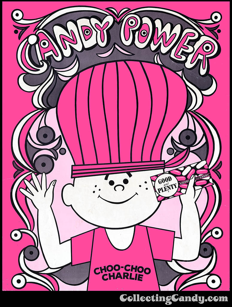
Good & Plenty – Choo Choo Charlie Candy Power – mail-away day-glo 22″ x 28″ poster – late 1960’s
I’ve had that poster on display in my apartment a few different times since acquiring it and though it took years of hunting, I finally tracked down its mate in the form of the “Chew-In” poster:
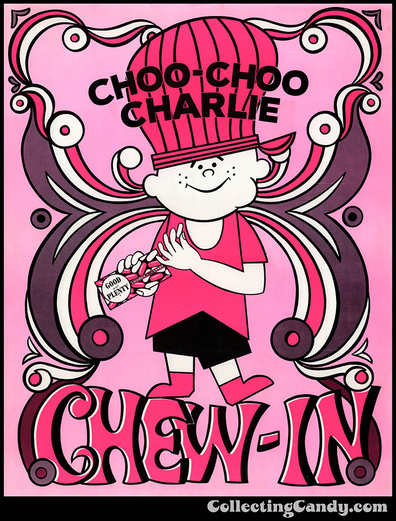
Good & Plenty – Choo Choo Charlie Chew-In – mail-away day-glo 22″ x 28″ poster – late 1960’s
I really dig Good and Plenty’s attempt to be cool and hip-to-the-times by adapting what was, at the time, contemporary terminology to their product. It’s comparable to companies utilizing the YOLO and “selfie” movements in recent years. It might not actually do what it’s it is designed to do, yet I find it appealing nonetheless.
Incorporating flower power or hippie cultural designs into an ad campaign for consumer goods was something that would be done by other ad agencies and brands during the era, with one of my favorites being 7-Up soda. Here are a couple visually-striking examples from my collection:
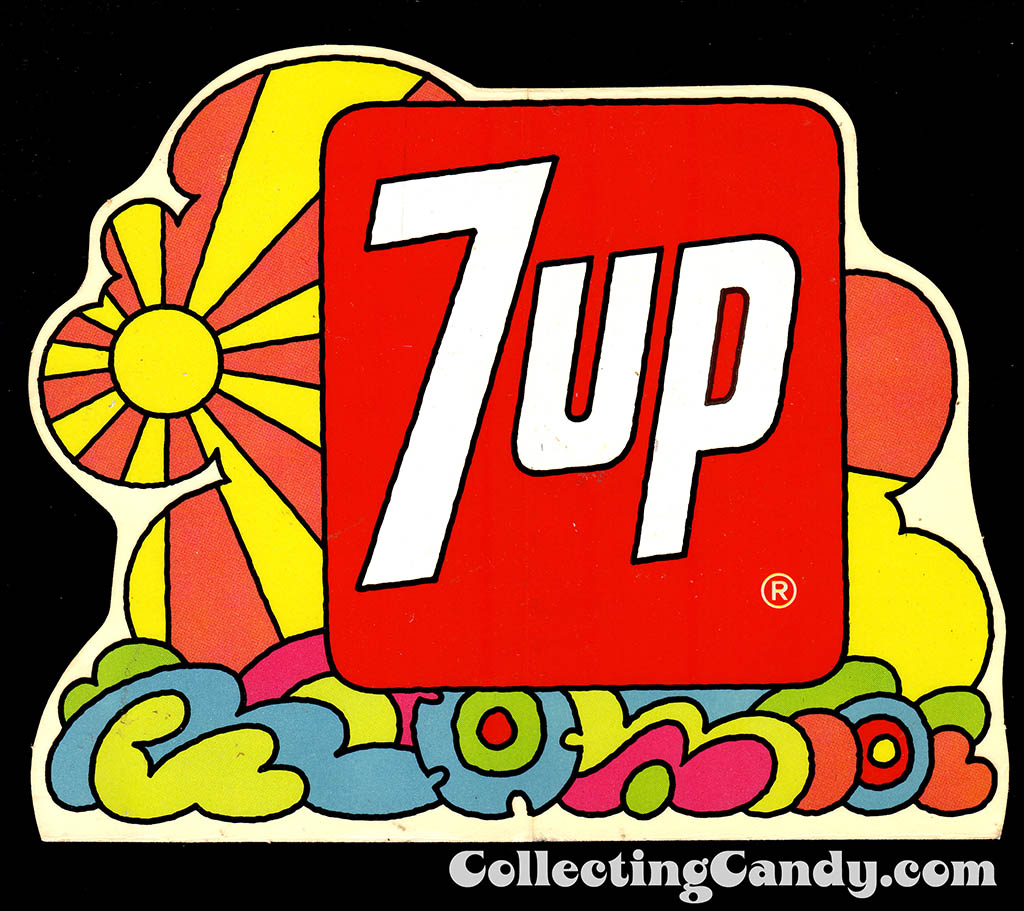
7-Up – Sunshine Hippie design sticker – Early 1970’s
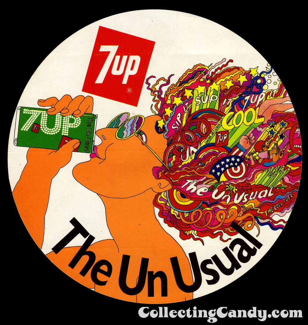
7up The Un Usual – sticker – Australia – 1970’s
You can even find some flower power imagery in the border of this 1969 Cap’n Crunch mail-away poster. It’s quite colorful:
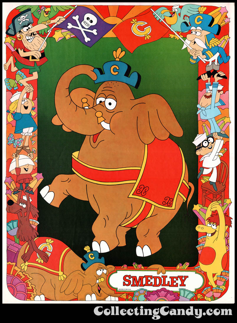
Cap’n Crunch Cereal Premium Poster – Smedley – 1969
I think it’s interesting when large companies attempt to graft cultural relevance onto their products, because the results can be far ranging. When it does well, as in the case of that 7-Up campaign, it leaves us with beautiful and unexpected work that can transcend commercial art. But even when it doesn’t land quite that solidly, we can end up with something that turns out to be appealing for its nostalgic charm like the two Good and Plenty posters featured today. It’s fun stuff.
And that’s everything I’ve got on Good and Plenty’s day-glo Choo-Choo Charlie posters of the late 1960’s. See you next time!


Beautiful G&P posters! I love the Day-Glo pink. You’re always amazing me with things I’ve never see. Awesome!
Thanks, David. Yeah, these are pretty striking in person due to the use of the fluorescent inks. Still need a blacklight to really see them pop. Haven’t tried that yet. 🙂