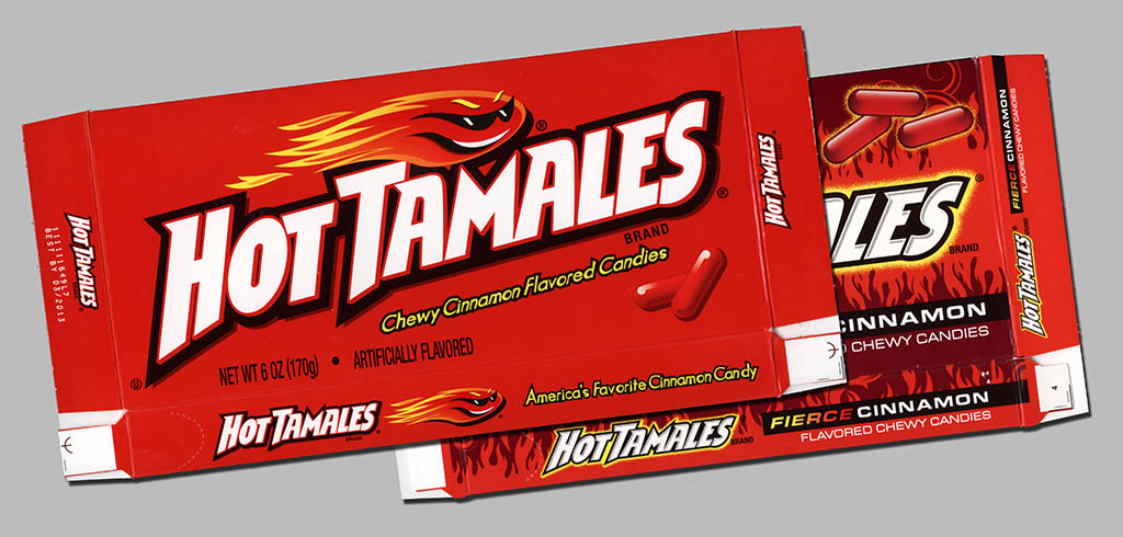
Collecting candy oftentimes starts like many collectible hobbies in that it can begin with a search for some kind of personal nostalgia – that’s what first prompted me to start hunting down old candy packaging. In my case, I was looking for the old style of Hot Tamales box that I grew up with.
But sometimes collecting candy starts when a person notices a change on the store shelves – suddenly, a product that they had become familiar with loses a mascot, gets a logo change, or otherwise alters its look. I’ve talked to several collectors who started with that as their initial impetus – a change in packaging. It is for that reason and more that when a classic candy brand receives a significant packaging redesign, we here at CollectingCandy.com take notice. Not to mention that the product we’ll be looking at today is one of our faves: Hot Tamales!
Back in 2004, Hot Tamales replaced its’ Sunglasses-wearing Sun mascot with a flaming fireball character – also wearing sunglasses. It’s an evolution I covered in my early piece, Hot Tamales – The Cinnamon Center of my Collector Heart. That red fireball box had remained largely unchanged until just this year.
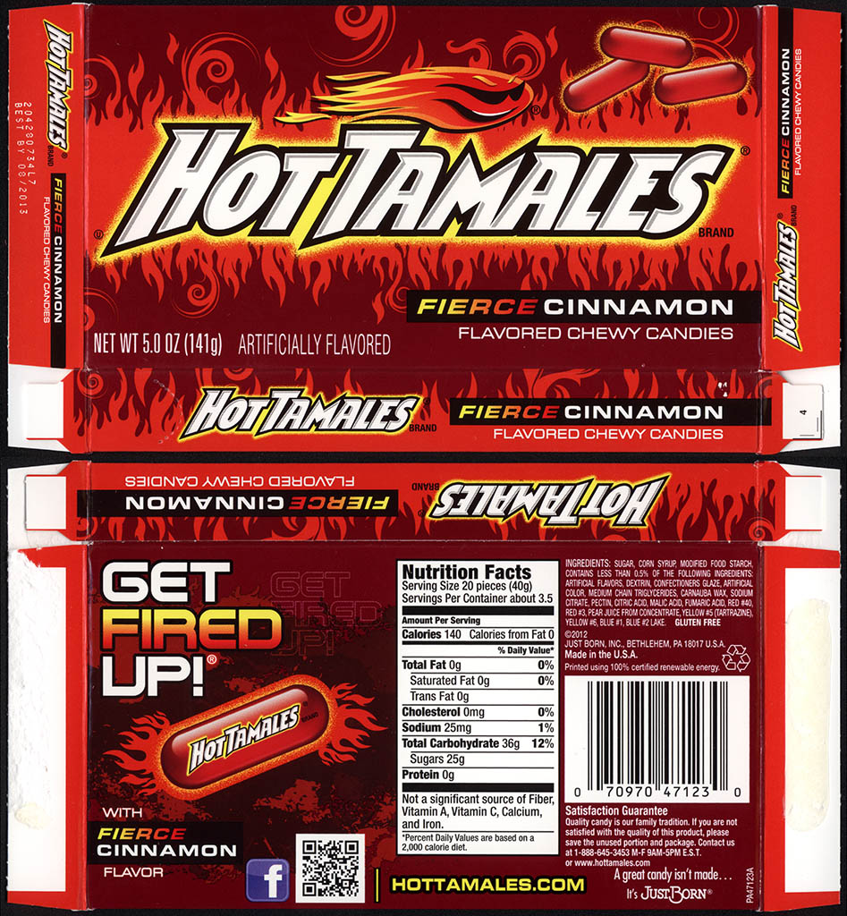
Seven years is a pretty good run for a major package design, so it’s not surprising that Hot Tamales got the upgrade treatment this year. Many of the elements from the outgoing box remain, but the look of the new packaging is decidedly more intense. I can say without reservation that I love it. And here it is:
I’m quite pleased that Hot Tamales have not lost their mascot, as I think that would have been a tragedy. So our fireball mascot remains, and the core logo design is intact, but the rest of the box is quite different.
One item to note which is not part of the graphic design is the fact that the “theater boxes” for Hot Tamales have been reduced from 6 ounce size to a 5 ounce size. This appears to be happening industry wide, as I’ve noted a similar change with Ferrara Pan’s theater-sized offerings. I suspect this is an earnest attempt to reduce portion size in the wake of public opinion that portions have become too generous.
I have to admit that when I first saw this new design box, I thought it might be a new design for Hot Tamales Fire, or perhaps something else entirely. It was such a lively design and the flavor was described as “fierce” cinnamon – I suspected that maybe this would be some new kind of Mega-Hot Hot Tamales. But it turns out these changes were simply to highlight what the standard Hot Tamales were already bringing to the table. It’s good bit of marketing that resulted in quite an attractive new packaging design.
The outgoing box designs will likely be on shelves throughout the rest of 2012, but soon they will disappear from stores, replaced by the new look. Soon, the flat-red box will be “old school” and we will look back on it with a nostalgia of its own.
I wonder if this design change will give someone the idea to start saving a box here and there, and starting their own collection? If they do, I hope they eventually join us here at CollectingCandy.com.
And that’s all I’ve got for today on this significant packaging upgrade of one of my favorite confectionery classics. See you next time!


Kudos to the Hot Tamales people on the new box! It’s fantastic!
Are they re-designing the Hot Tamales Fire box, too?
Brandon,
I don’t know about the Hot Tamales Fire box. I had begun to think that 3-Alarm were replacing the Fire product, though I’m not sure.
The new design looks like hell…no, it really looks like hell! Good idea to get the “hot” factor across, huh?