About a year ago, I covered my first encounter with the Unreal candy brand, a line of organic candy bar offerings meant to compete with and offer a healthier alternative to the candy isle standards.
Back then I noted how striking Unreal’s packaging was and pondered whether its unique and unusual look would grab the attention of a typical consumer. It’s a year later and the Unreal brand is still around but with new-look packaging, still featuring a strong design but one that consumers might find a little easier to embrace.
Here’s an example of Unreal’s peanut butter cups wrapper from last year, which I’ll contrast with the new design:
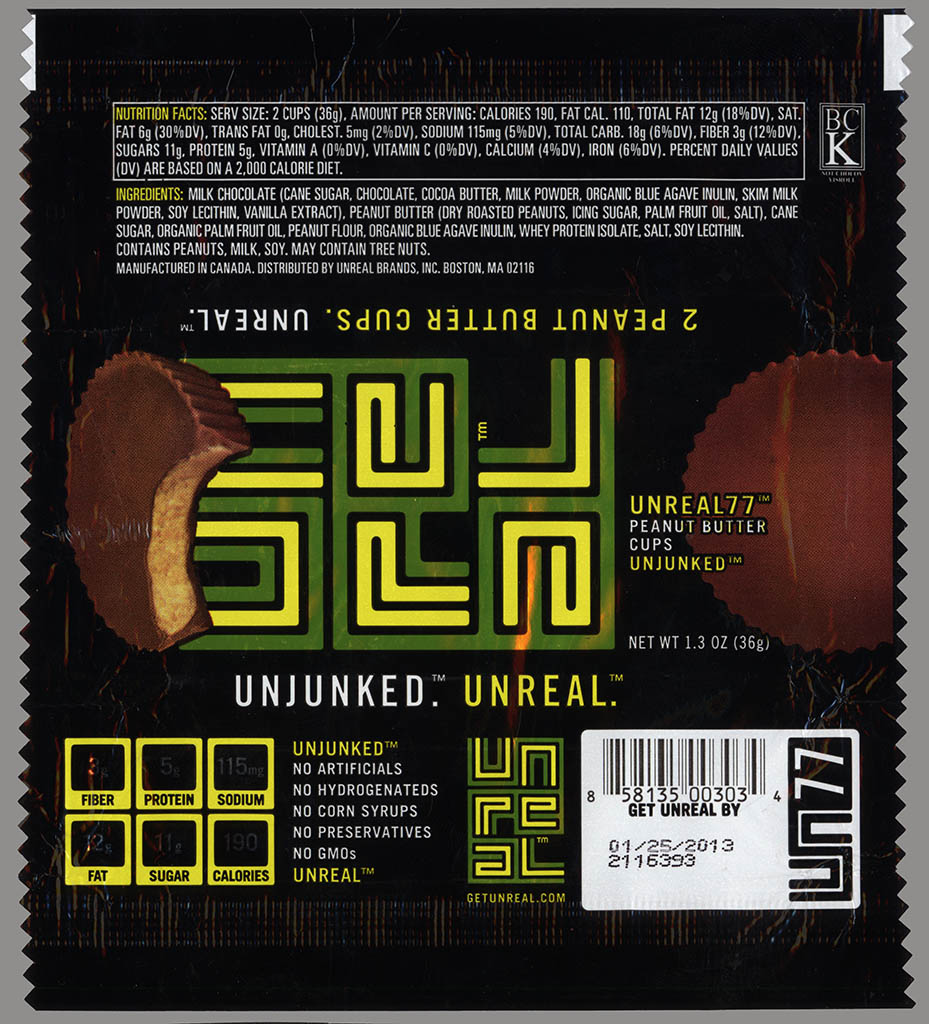
Unreal 77 – organic peanut butter cup – candy bar wrapper – 2012
And here’s the new look:
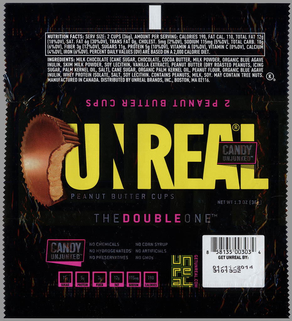
Unreal – Peanut Butter Cups – The Double One – candy unjunked – candy wrapper – June 2013
The new design still retains a smaller version of the more symbol-looking Unreal logo on the back of the wrapper, while introducing a much more standard, easier-to-read look for the front. Another design feature, naming the bars with numbers, has been dropped in the new version.
So far I’ve only found one other Unreal offering with the new design wrapper; the chocolate caramel peanut nougat bar. Here are the old and new wrappers:
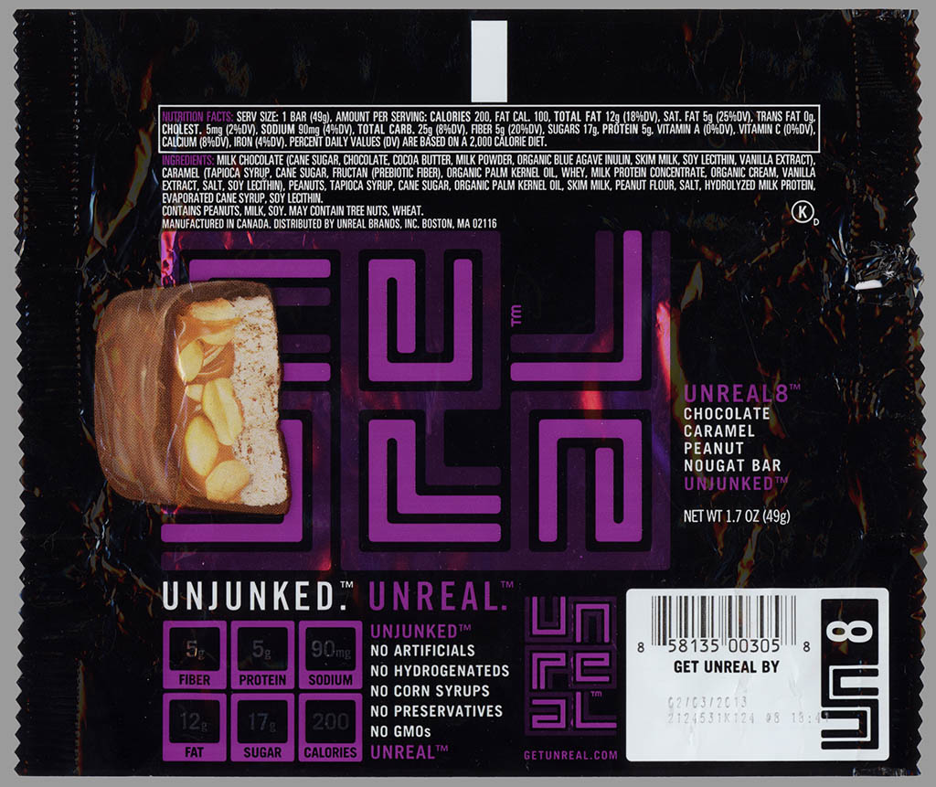
Unreal 8 – organic Snickers – candy bar wrapper – 2012
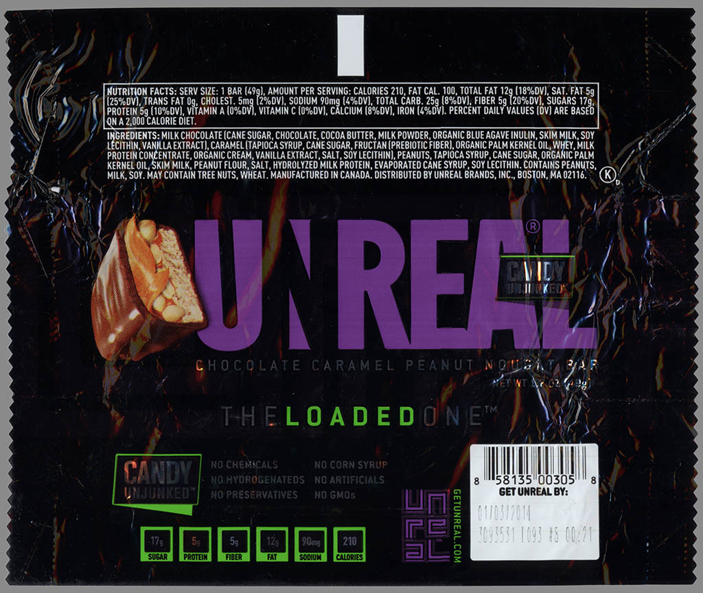
Unreal – Chocolate Caramel Peanut Nougat – The Loaded One – candy unjunked – candy wrapper – June 2013
Though I’m still hunting for the other Unreal offerings with new-design packages, I did spot a few of their larger bags with the new look and snapped these photos:
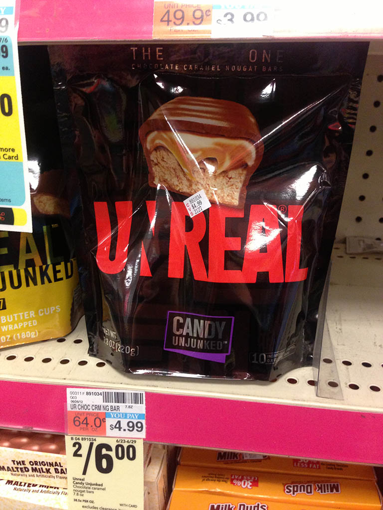
Unreal Chocolate Caramel Nougat large package – June 2013
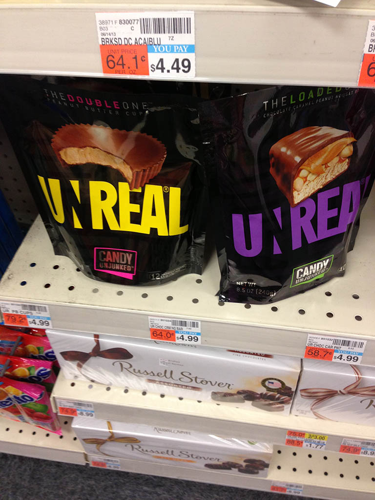
Unreal Chocolate Caramel Peanut Nougat & Peanut Butter Cups large packages – June 2013
If you check out your store’s candy shelves in the next month or two, you might see both the old and new Unreal designs on display for a while, until all the old designs disappear forever. The outgoing designs were so unusual and unique, you might want to grab an example for your own collection.
And that’s everything I’ve got on Unreal’s updated packaging designs. See you next time!


Glad to see that this brand hasn’t disappeared. I’ve been looking for them on shelves for the past few weeks and haven’t seen them.
I wouldn’t miss the M&M-style ones if they were dropped. The Snickers-style and the peanut butter cups are the best of the line.
New branding is much better than the old, in my opinion.
I like the new packaging better. Although the old logo was creative, the brand name is now much more clear to the average consumer.